Brought in to lift activation.
I started where people were giving up.
Viaduco is a mental health app — AI-guided support built on Cognitive Behavioral Therapy. I came in to improve activation. People were installing the app and leaving before they got anything from it, so I started with the first five minutes — and ended up reworking the visual language of the product and the way it presents itself in the App Store. viadu.co ↗

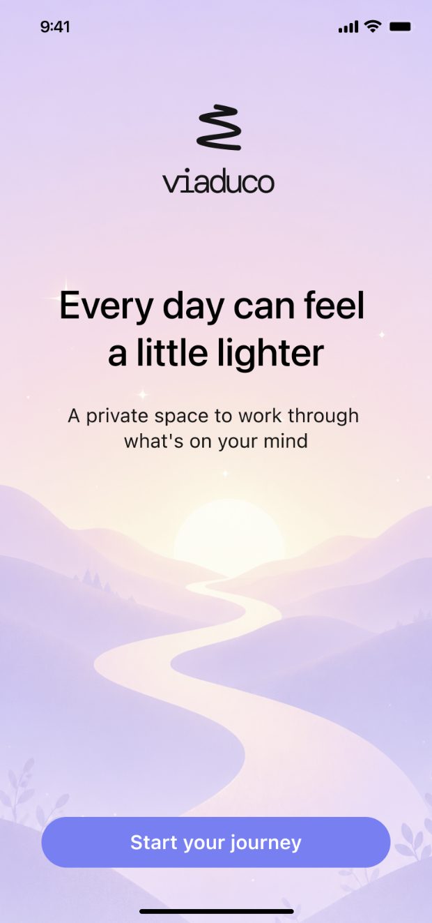
People arrive low. The onboarding made it worse.
Someone downloading a mental health app is rarely in a good moment. What met them was dark grey, visually noisy and generic: heavy type, a lot to read, several questions before anything useful, and a fake progress bar personalising a plan. High cognitive load exactly when a person has none to spare.
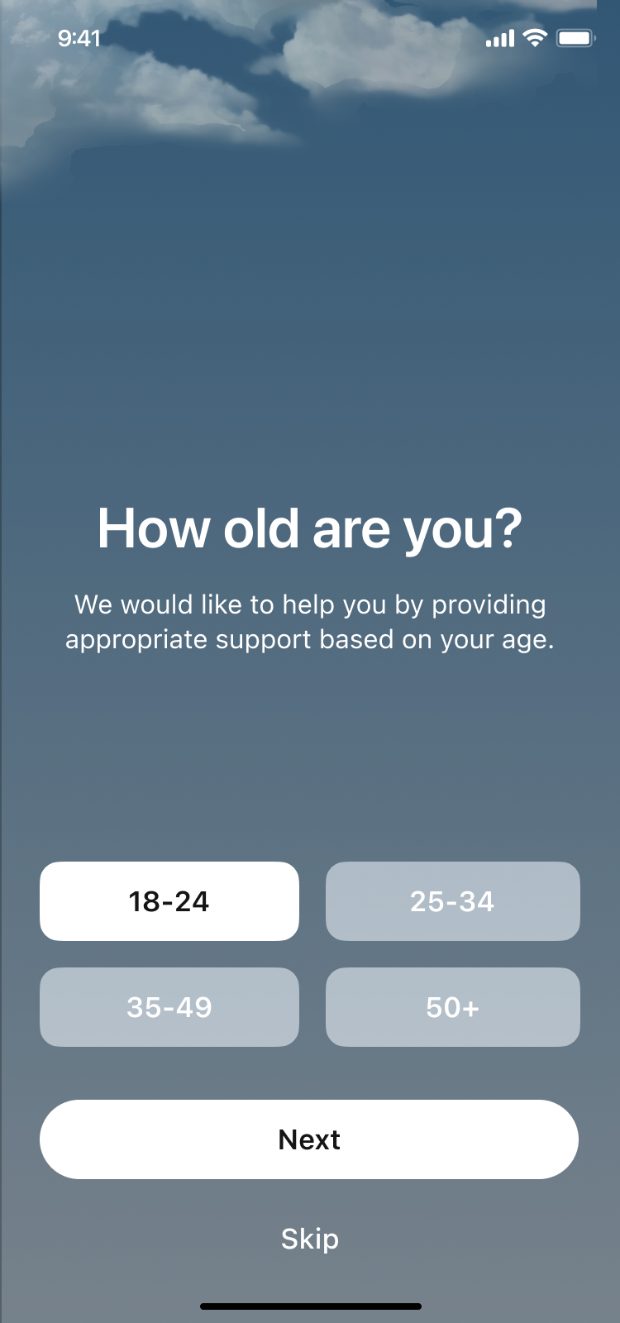
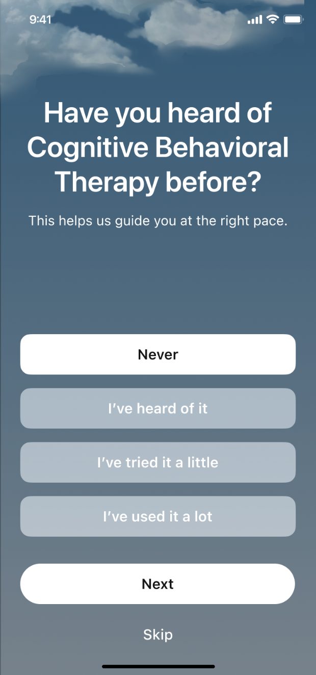
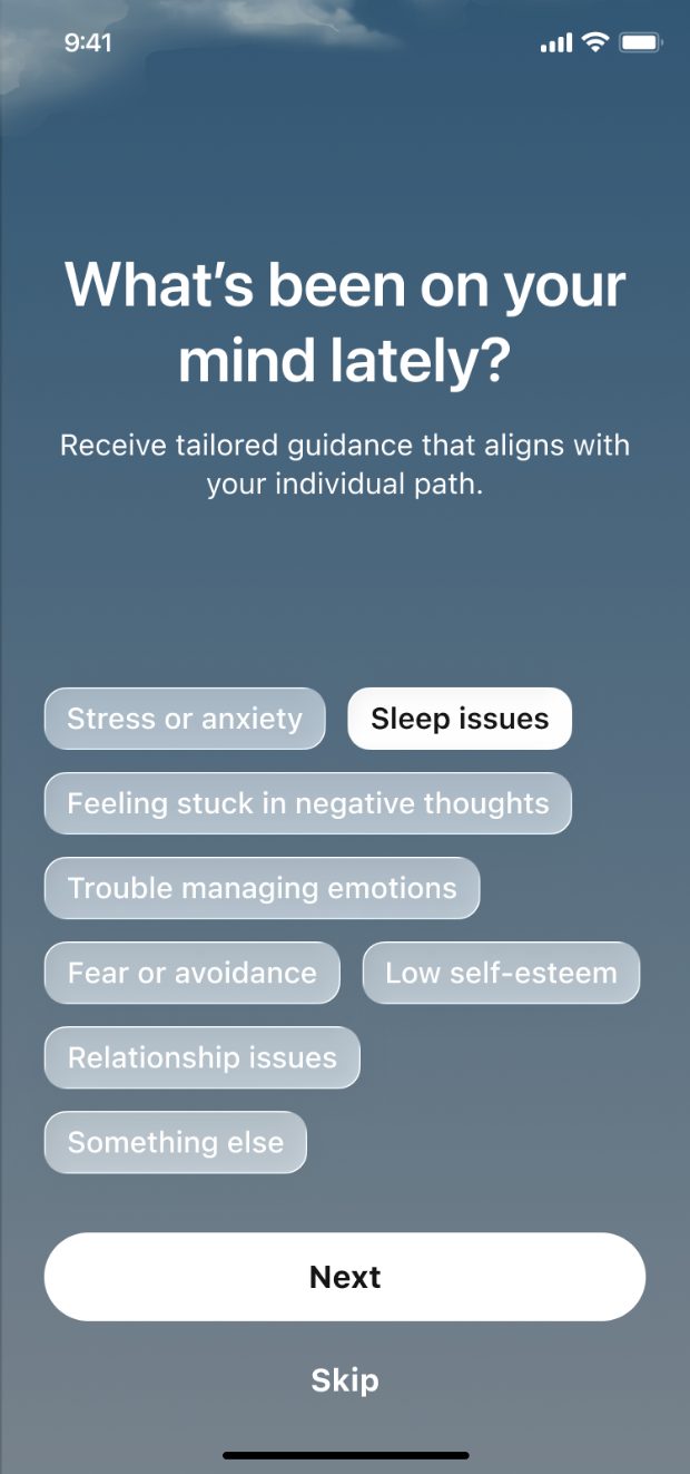
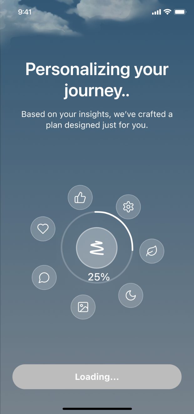
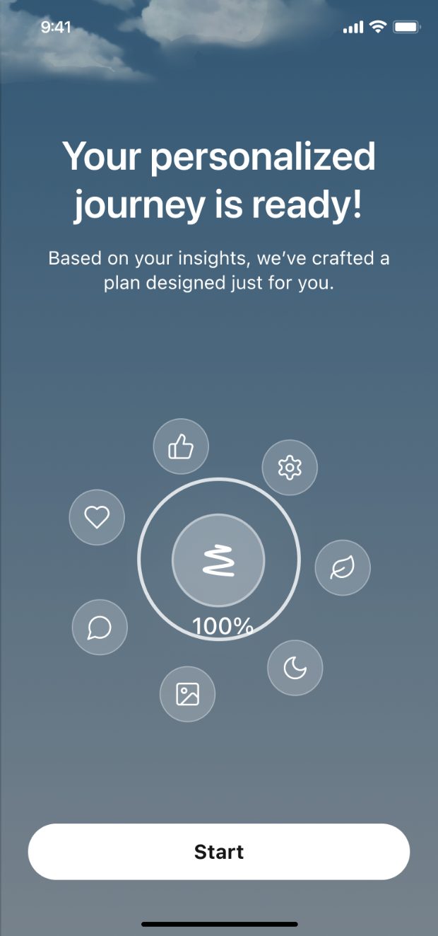
Experience first, sign-in second
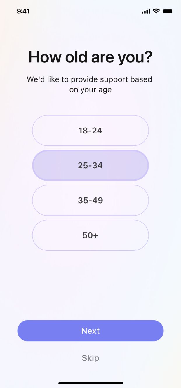
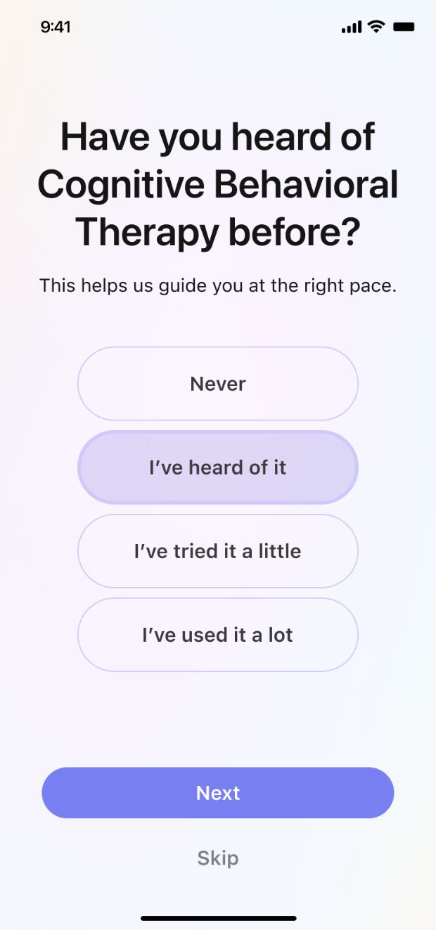
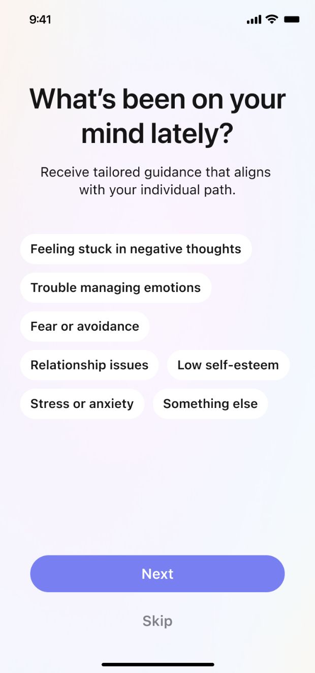
The old flow asked users to commit before they understood anything. Moving sign-in later let the product establish its tone and value first — with a way to keep going without an account at all.
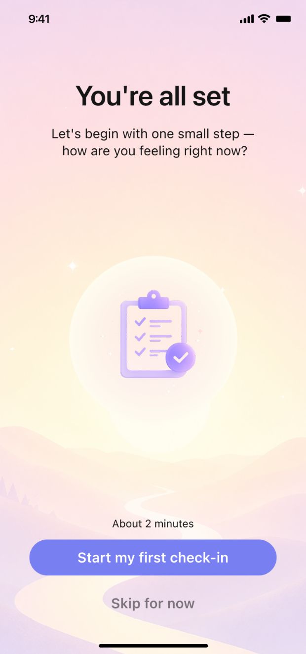
The rest was subtraction: lighter type instead of heavy display weights, a warm single-family palette instead of dark greys, one idea per screen, and a real first check-in where the fake personalising bar used to be.
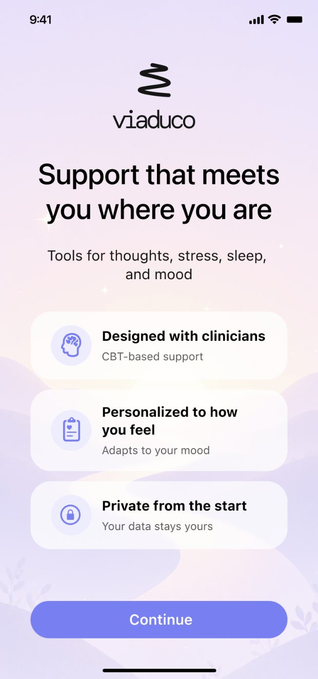
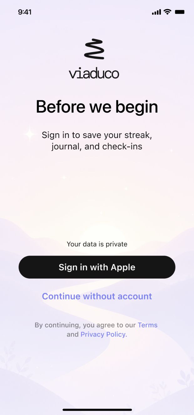
Then the store stopped matching the app
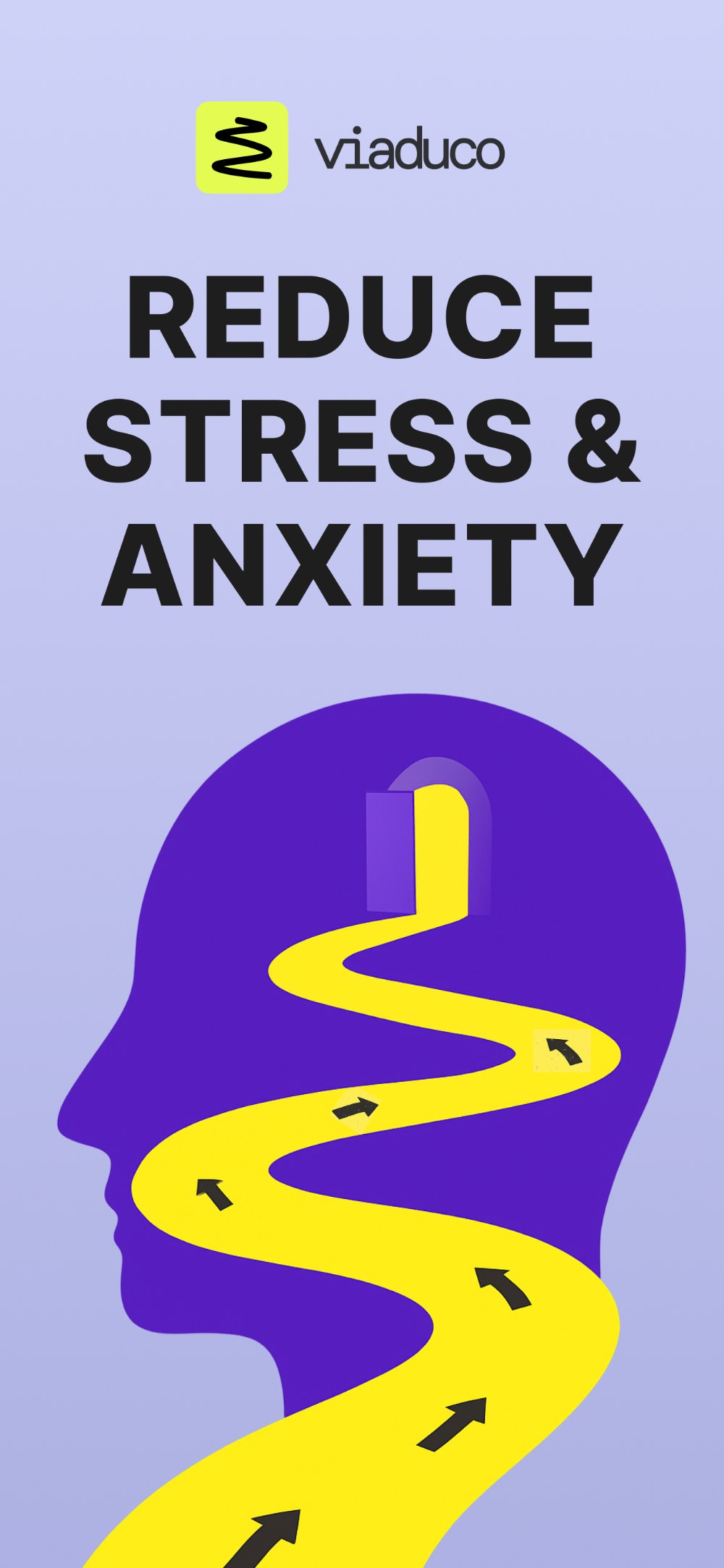
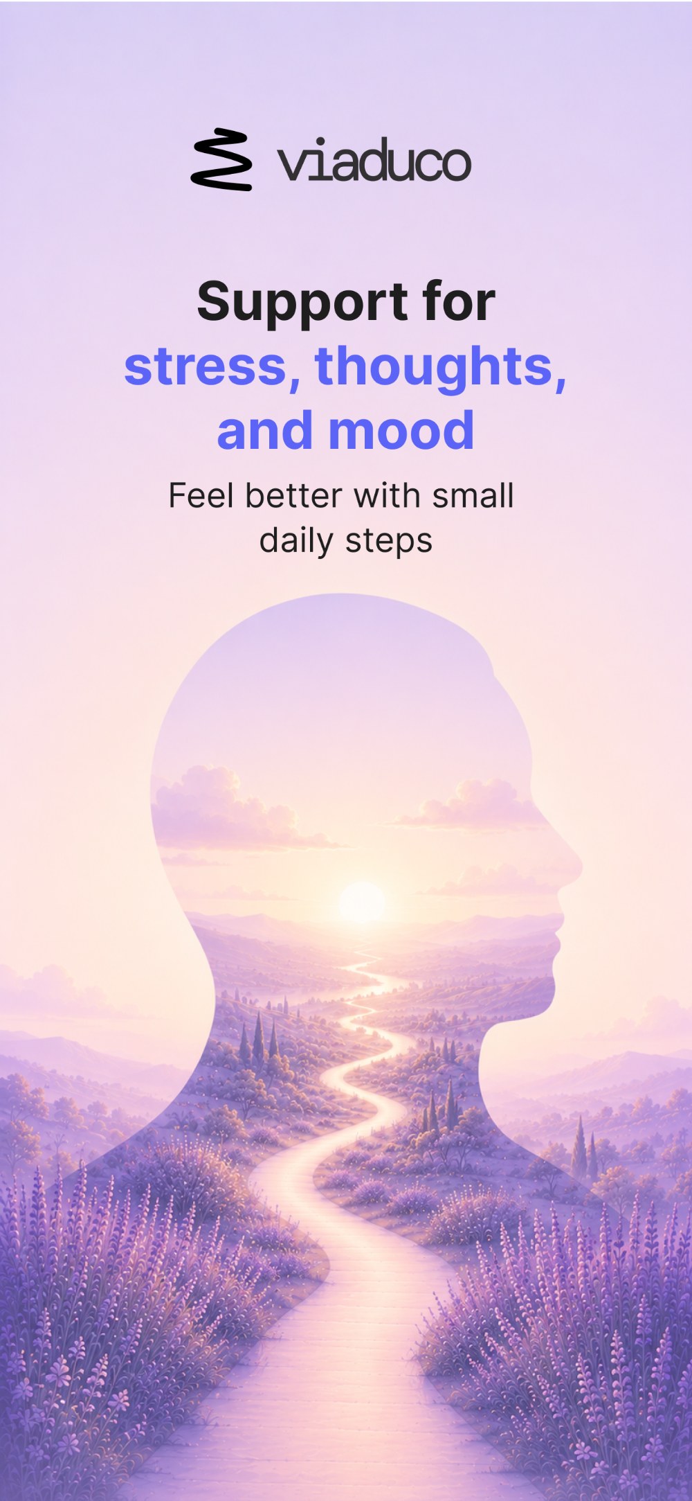
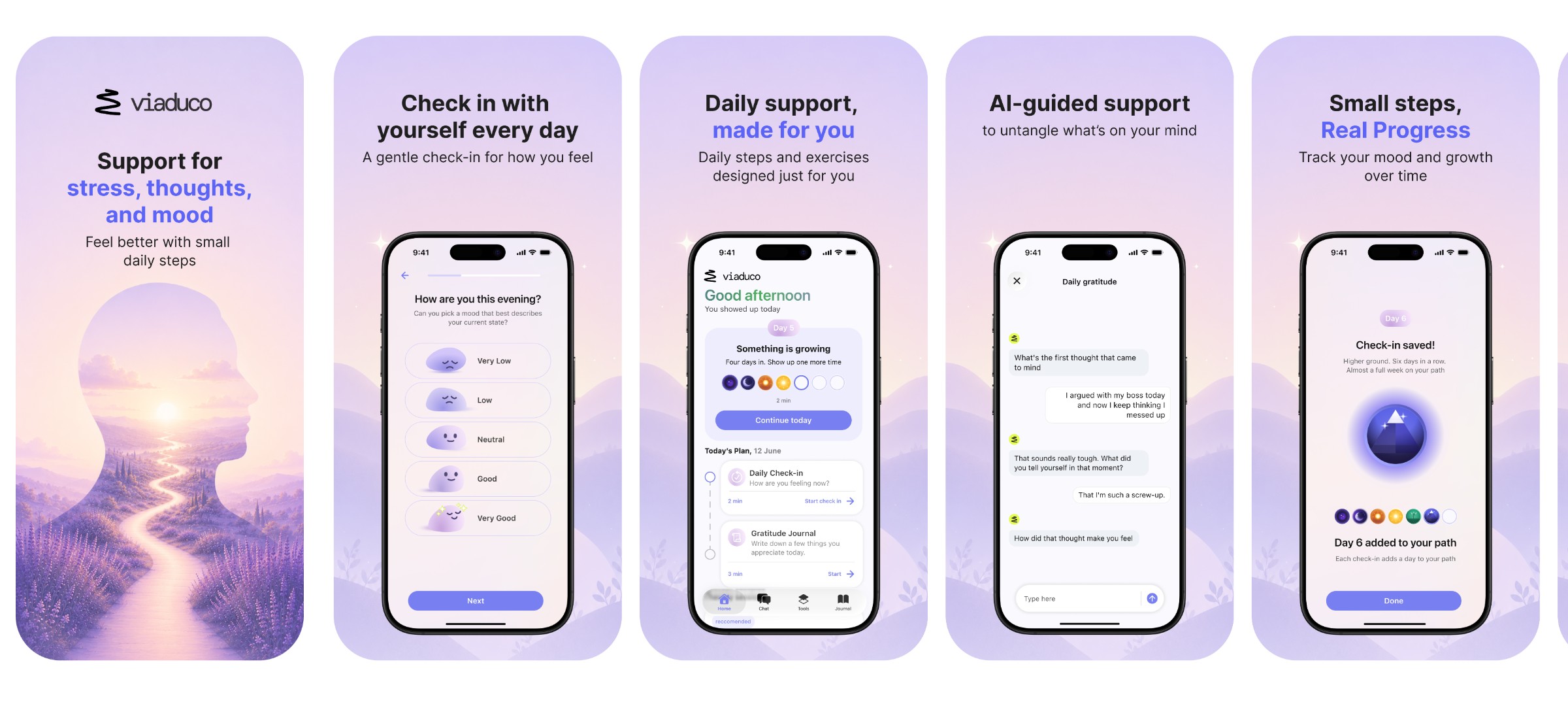
As we shipped new features the product moved on, but the App Store page didn't — so people clicking an ad met a different app than the one they'd been sold. The old page led with a bold figure on a road; the app behind it was quiet and grey. I studied how competitors present themselves in the store, then rebuilt our page in the product's new visual language: same tone, same warmth, in the order the features actually arrive.
The lead image is the first thing anyone sees of the product, so I designed its replacement specifically for the store.

That number is the store page — the step I could measure cleanly. The onboarding rebuild sits behind it, measured by completed first check-in, which is the metric I'd hold it to.
- —Helped keep things moving when part of the team left — finding people and briefing them so work continued.
- —Rebuilt the onboarding: fewer asks, one idea per screen, and a first check-in instead of a personalising loader.
- —Reworked the product's visual language — warmer, lighter, more current — and redesigned the onboarding UX, UI and copy around it.
- —Designed the App Store screenshots in the product's new visual language.