Killed the 90-minute onboarding call
Aerial survey software: upload imagery from a survey flight, train a detector, find objects, pay for what you used. Every new customer needed an hour and a half with an engineer before they could do any of it. That call wasn't a courtesy — it was the missing interface.
The interface exposed actions without enforcing the sequence the product actually required. Roughly half the functionality on screen wasn't working yet at that stage. A new user couldn't tell what had to happen first — so the engineers had to explain it, one customer at a time.
Four tool groups. Two panels. Two competing "Add" buttons. No indication of what had to happen first.
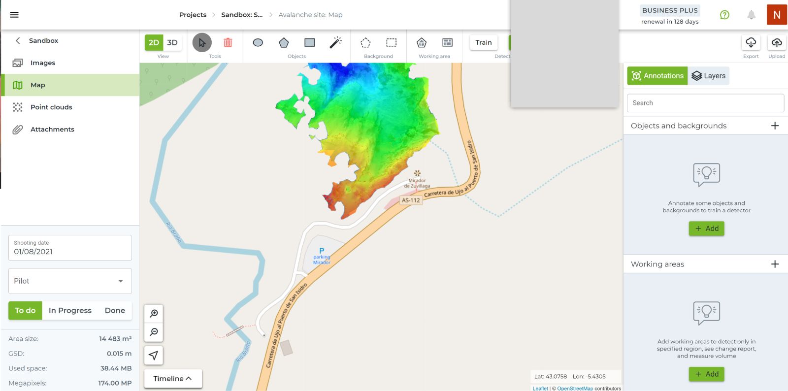
The sequence had to live in the interface
Progressive disclosure opened the product step by step instead of showing every available tool at once, with guidance where the concept was genuinely new.
One offer. One action. The pricing model is explained by using it.
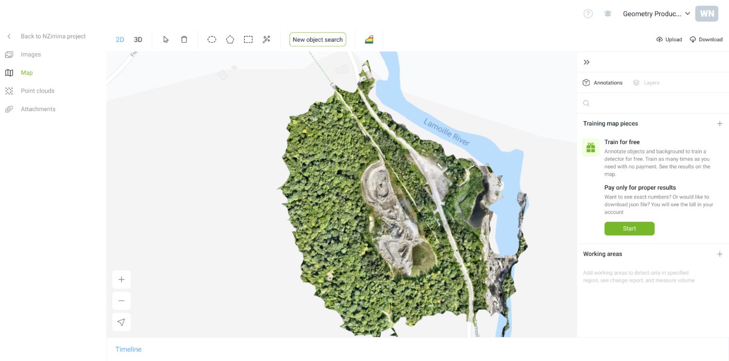
Explain annotation when the user actually needs to annotate.
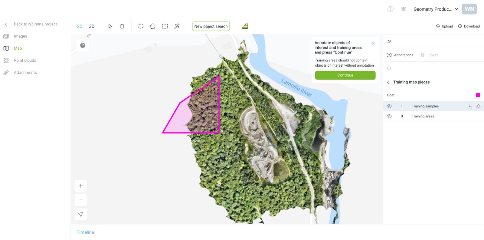
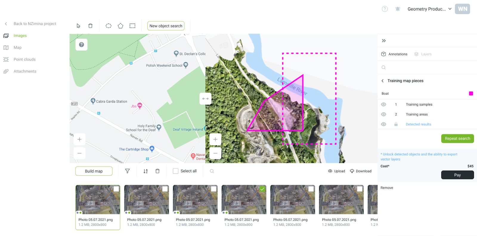
Ask what, where and how only when the user is ready to run the search.
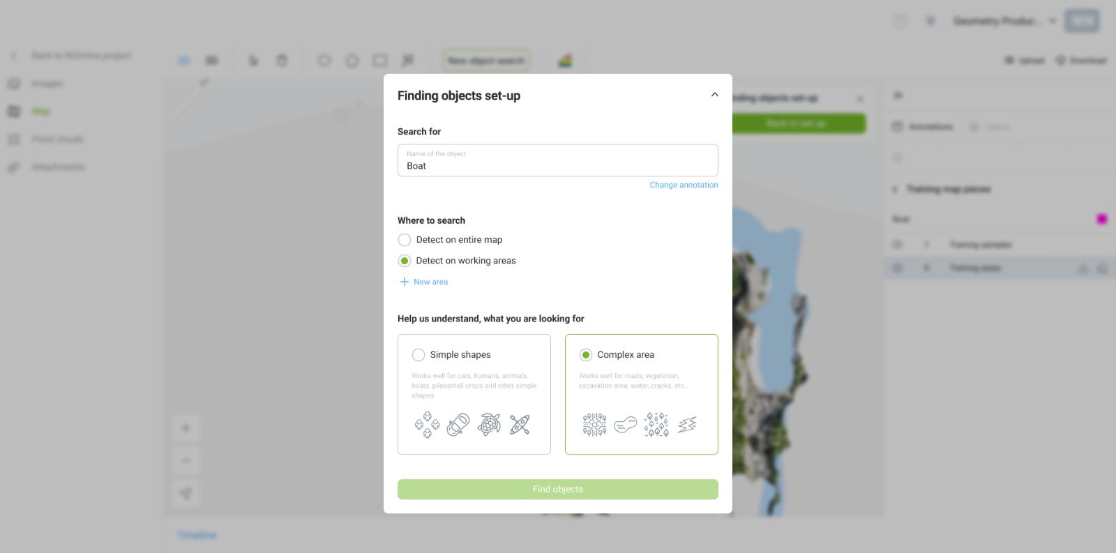
Put the cost where the decision happens
Billing was based on a deposit that drained differently depending on the task. Without context, the model could feel arbitrary. We showed the cost at the moment of the decision — and itemised spending by action and team member.
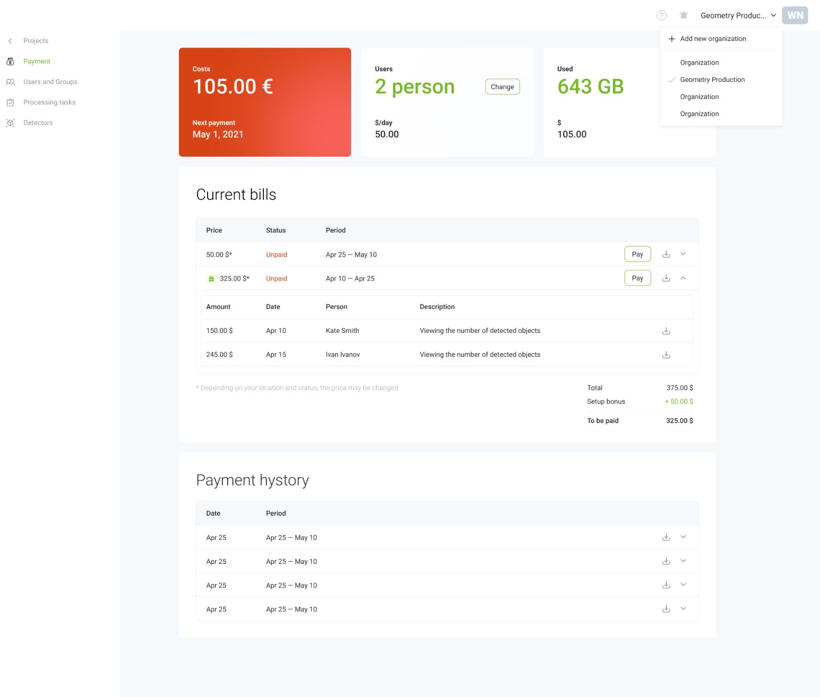
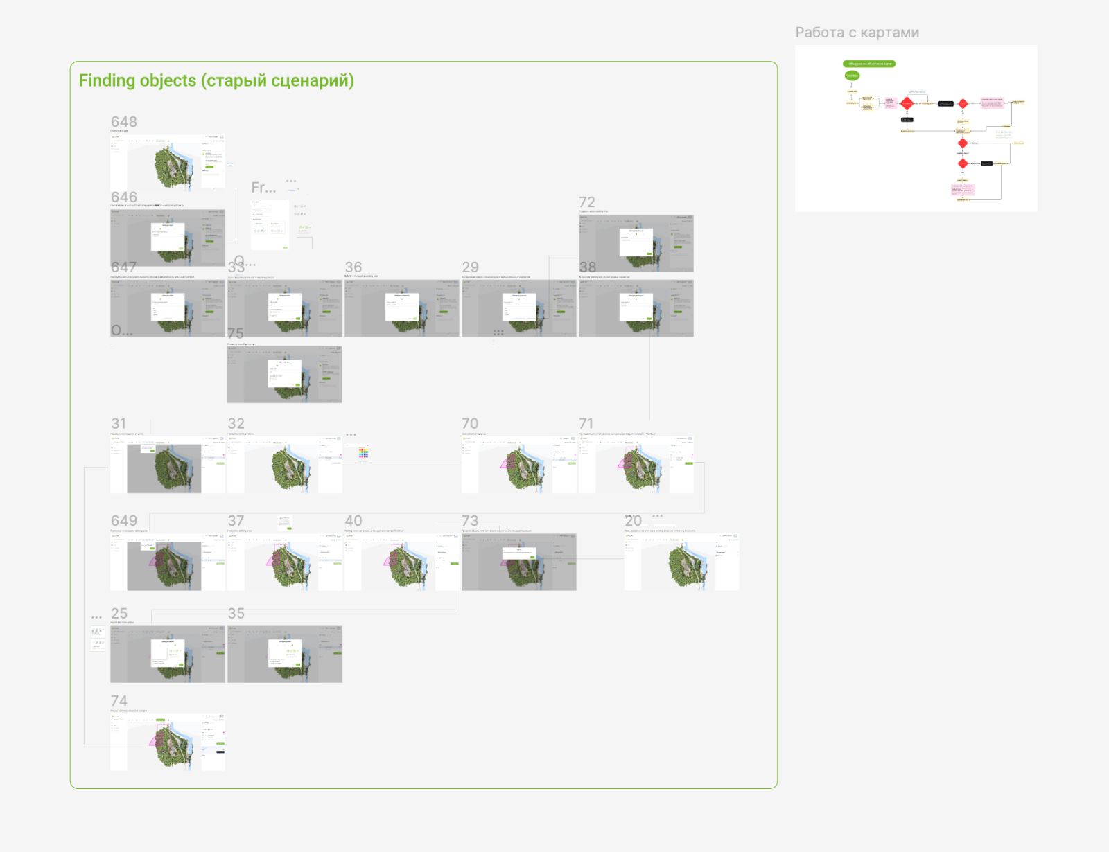
Founder and experienced-user interviews · user stories and CJM · technical constraints · flow reconstruction. We mapped the existing scenario screen by screen to expose broken dependencies and find where payment had to enter the flow.
The redesigned flow shipped to the client and replaced the engineer-led onboarding call. The work covered three platforms — desktop, tablet and Android — each with its own scenario and its own constraints.