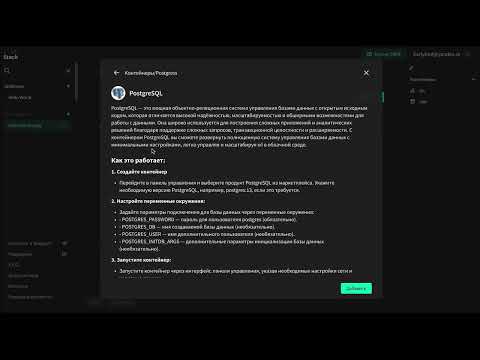
From an idea to a public beta in 6 months
L1veStack is a cloud platform for developers built around a simple idea: deploy from code, understand what you're paying for, and skip the complexity of a traditional cloud console.
I joined before there was a product or a design team. My role was to turn the initial product vision into a focused experience developers could actually use — and to get an MVP in front of real developers as fast as possible, because until someone tried it we were guessing.
The vision existed. The product didn't.
The core ideas came from the founders: a code-first deployment experience and a pricing model designed to make cloud costs easier to understand.
What wasn't clear yet was how those ideas should come together as a product — who exactly we were designing for, what the core flow should be, and how much we needed in a useful first release.
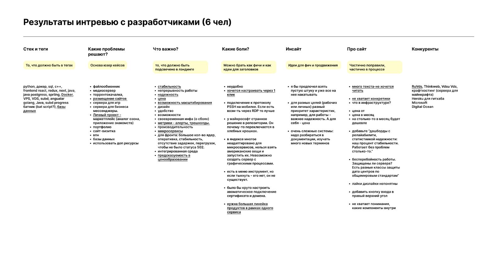
I interviewed 10 developers who already used cloud services: why and how they used them, what they expected from a console, and which products had already shaped their habits.
Turning the idea into a product
Developers already had strong mental models for how cloud products work — DigitalOcean stood out for being simple and predictable. Together with the team I translated the vision and the research into a few principles for the first version.
Keep the familiar parts familiar
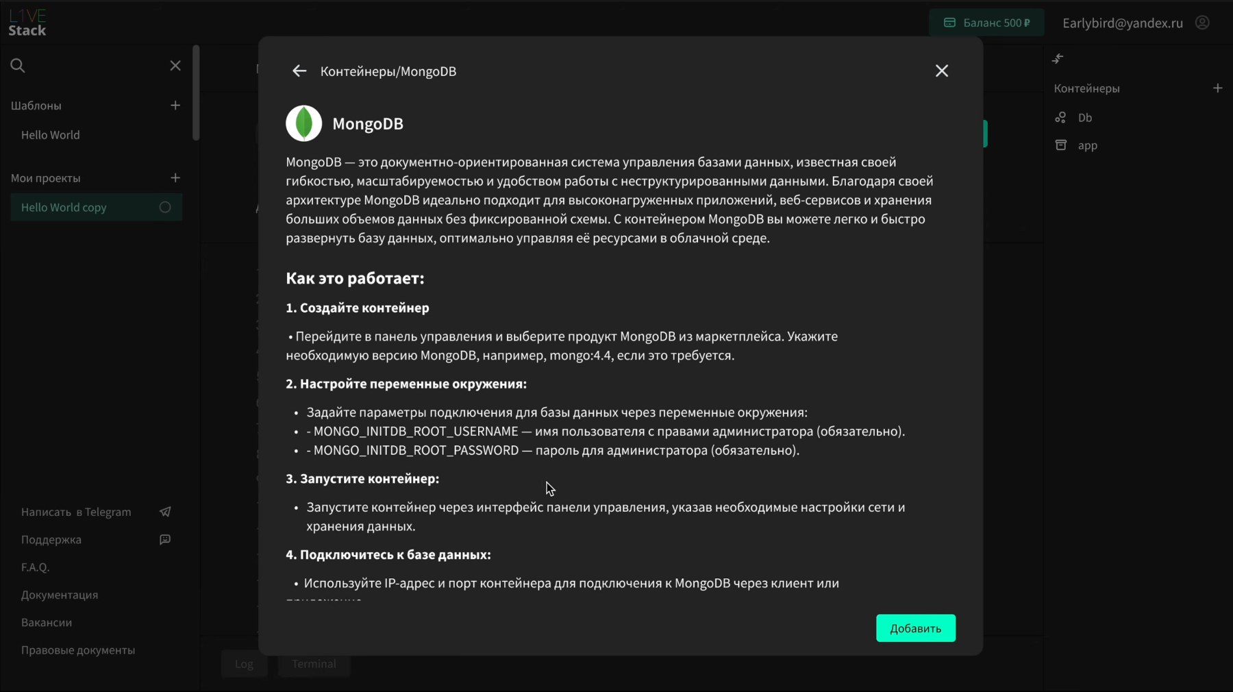
We followed established console patterns instead of inventing new navigation for familiar tasks: a central workspace, with project, resource and extension management around it.
Make cost easy to understand
The pricing model came from the founders. Our job was to make it legible in the product: a balance visible in the header, resource limits set where you configure them, and costs stated before you commit rather than discovered on a bill. The fuller billing views were built later, after my time on the project.
Put the differentiator where users can see it
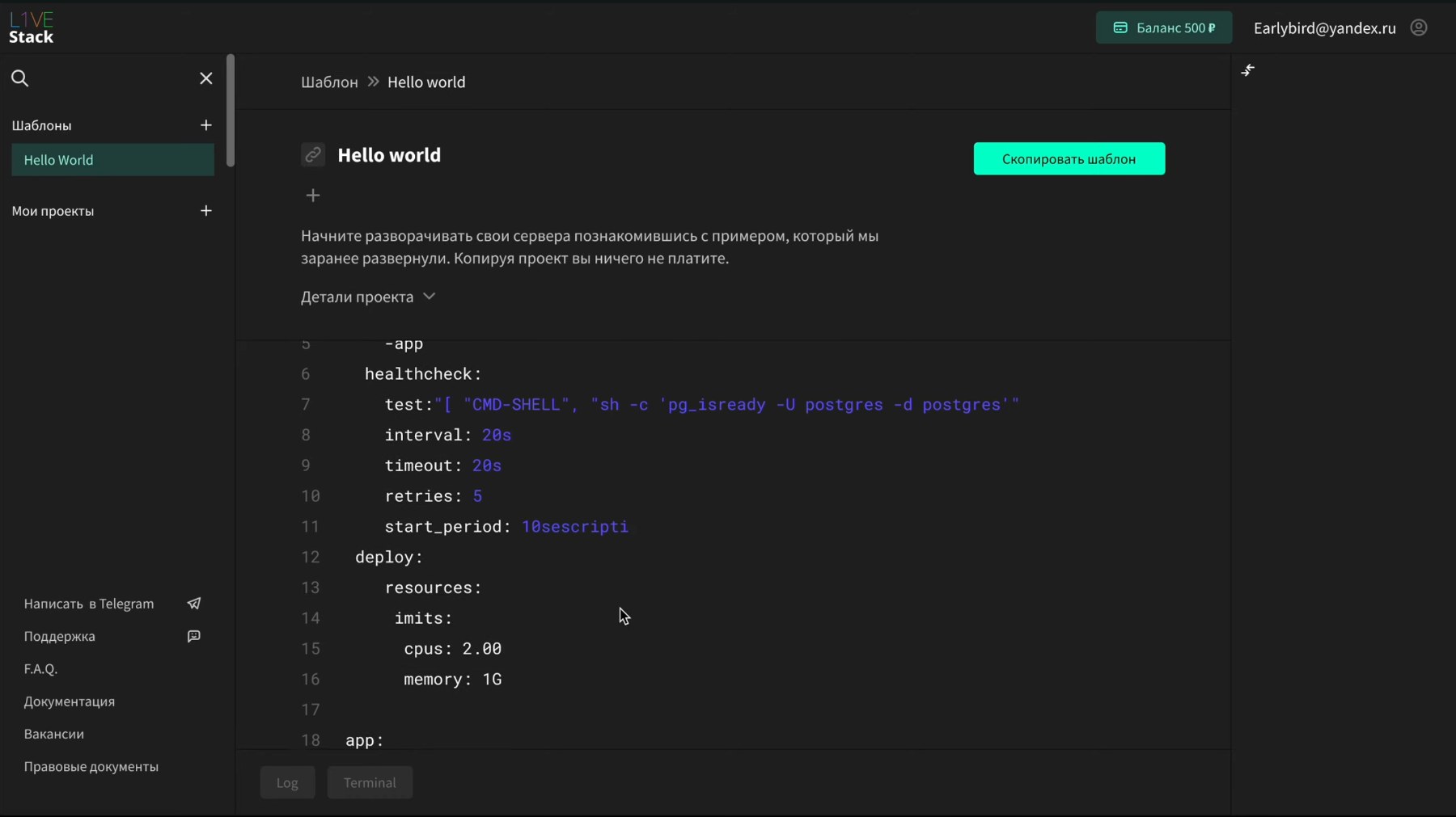
The built-in code editor was already a core product idea and a strong differentiator. We made it central to the experience rather than hiding it behind a conventional cloud UI — the screen above is what a user meets first, and it became the image marketing led with for a developer audience.
Keep the first release focused
The team had no shortage of feature ideas. I pushed to define one core scenario, ship it and test it before expanding. The goal wasn't a console that felt complete — it was one valuable path working end to end.
Keep the user in the flow
Deployment required user and payment details for legal and billing reasons. The conventional answer is to send the user off to account settings before they can continue.
Together with the designer and the engineering lead, we embedded that step directly into the deployment flow. When required information was missing, the interface asked for it at the moment it became necessary — without routing the user through unrelated pages.
The principle was simple: don't make the user learn our product structure just to finish what they came to do.
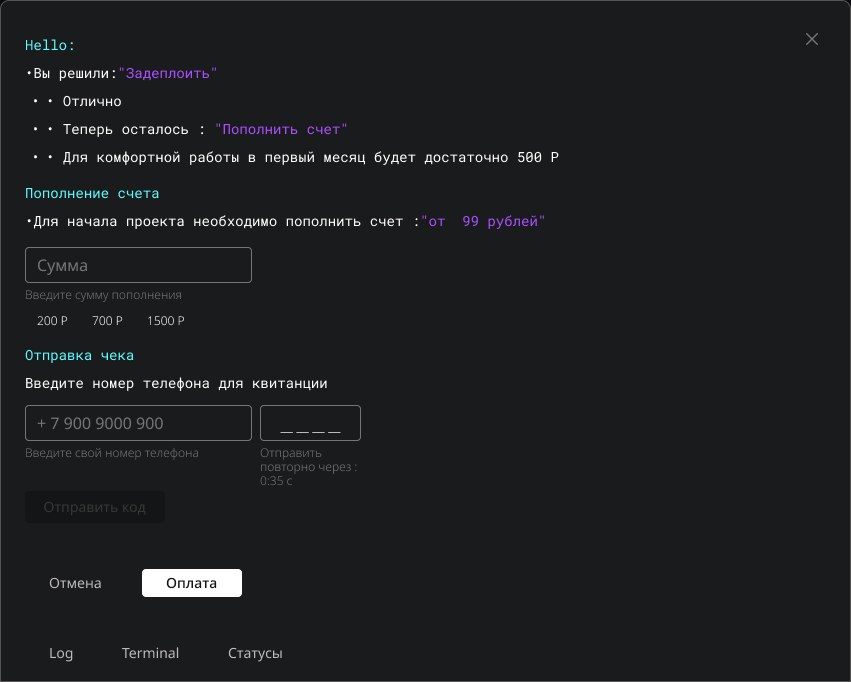
It also speaks the way the console does — in the terminal voice developers were already reading — so a billing requirement lands as part of the work, not as an interruption from another department.
From UX to shipped product
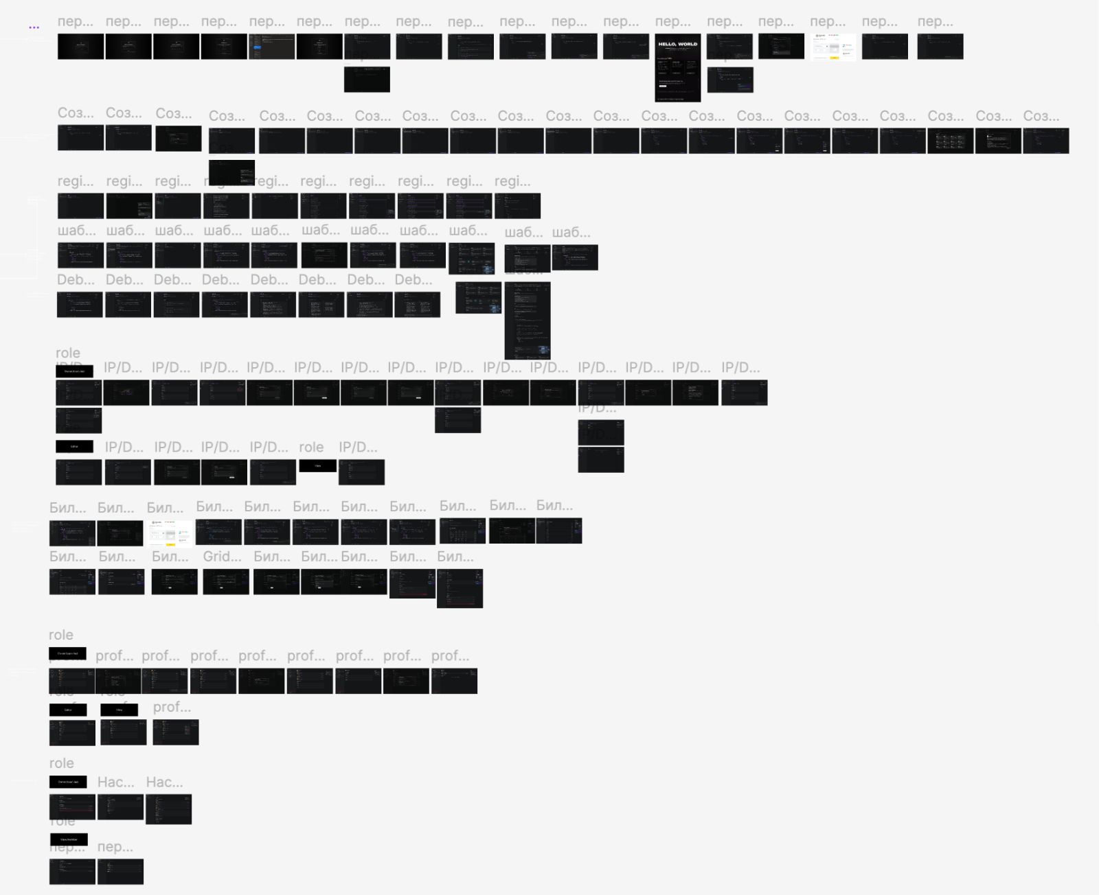
I mapped the core experience and designed the initial console, then expanded the design team as the product grew.
Together we developed the interface, UI kit and interaction patterns, staying close to engineering through implementation. My role increasingly became not just designing screens, but keeping the product coherent: aligning decisions, protecting the core scenario from feature creep, and making sure what we designed could actually ship.
Getting it in front of developers
Shipping the product wasn't enough — we also needed an audience.
I helped build the design team, found external contributors, and shaped a developer-focused content funnel around Habr and Telegram. By the time the product reached public beta, the content had already started building an audience and a lead base, before a dedicated sales team existed.